
Calligraphy Beginner Series Part 6 - Simple Designs
- Jul 29, 2020
- 4 min read
Updated: Mar 7, 2022
Creating greeting cards and phrases using calligraphy is fun and a great way to get some practice in too! You can download the worksheets here and warm up with a lowercase alphabet, and follow some simple design ideas. Add your own twist to them by mixing inks, or using different pens for each letter.
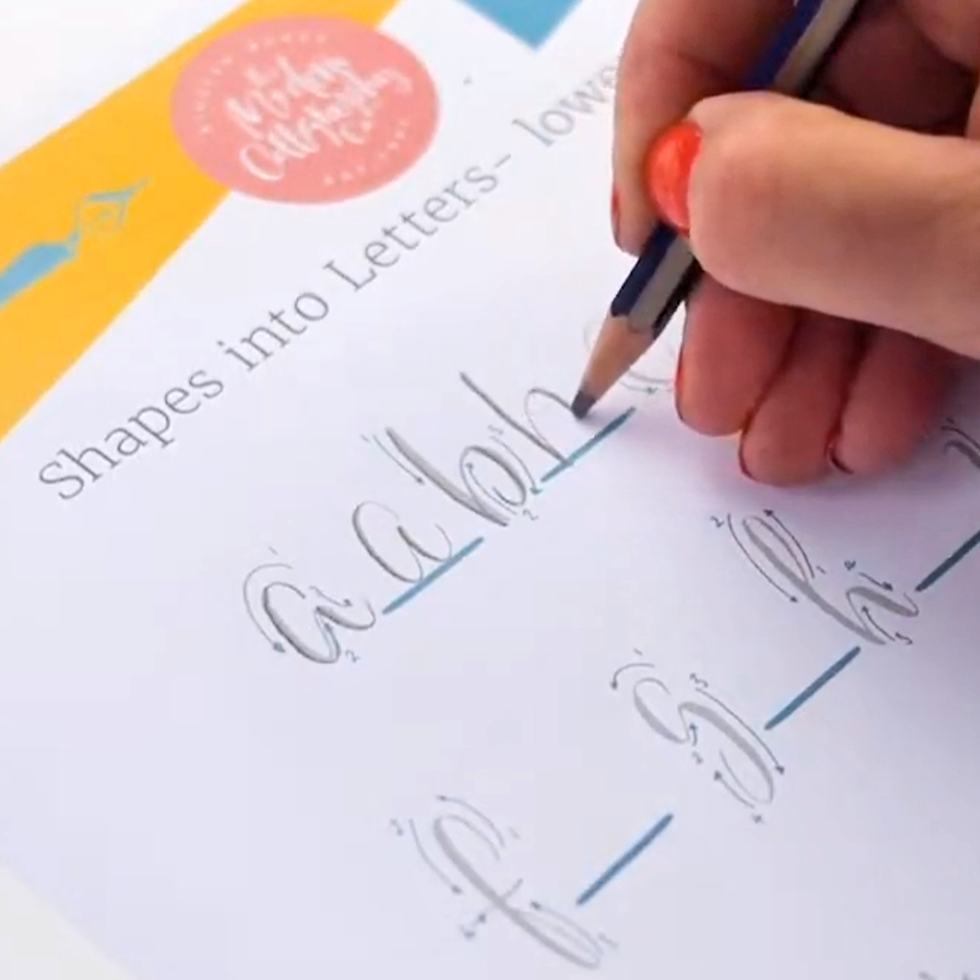
In my YouTube video that goes with this blog, I use a soft pencil as well as a nib & brush pen. Soft pencils are marked with the letter B, we usually write with an HB pencil, so find one that is softer - 3B or 4B. The softer pencils will give you a contrast between the downstrokes where you are pushing heavily and the light upstrokes.

Small brush pens like the Pental touch brush pen and my Sailor pen’s small brush create letters to the scale of a nib. If you use the large brush of the Sailor or any other larger brush pen, the letters will not only be bigger but thicker too. Visit our Amazon Page for all these pens.

If you do choose to try calligraphy with the pencil, you do need to apply quite a bit of force to give the downstroke it's weight. You aren’t able to get the same thickness that you can with the nib or brush pen, but a pencil makes it a great tool when you are learning as you need to be very deliberate when you change of the pressure you apply. This will help you to reproduce these movements without conscious thought, which is referred to as muscle memory. Muscle memory is acquired as a result of frequent repetition of the movement, so the more you do these simple alphabet drills, the sooner you will change the pressure without even thinking about it.
Making the thick downstrokes is easier with a brush pen, tip the pen slightly to the side so that the flexible brush like end is pushed to the paper surface. With a brush pen it is the delicate upstrokes that are the challenge. Keeping them fine and consistent is difficult, I use my fingers nearest the paper to steady my hand to help make these fine strokes.

Just as with the nib, I make the change of pressure very gradually when I need to make a curved shape, using those fingers to help lift the pen to its tip smoothly. I am careful about the release or increase of pressure so that the thick part is always to the side of the letters, never dropping to the bottom or continuing over the top of an arch. There's more on this in our book Secrets of Modern Calligraphy and join me on Instagram for lots of tips and tricks to help you improve your lettering skills.
Remember to move the paper, so that it is comfortable for you to write. Slide it upwards as you get to the bottom, and keep thinking about that smooth sensation for the downstroke. When using a nib, the tines need to hit the paper equally so they can open easily. Hold it flat with your other hand, mine keeps crumpling up because I am trying to keep my other hand out of the way so you can see what I am doing in the video.

Get the position of the paper right, I keep saying this because it so important. Everything depends on it!
Modern calligraphy doesn’t require you to make every letter identical. Instead, we can play with their shapes the suit our design.
Why not mix capital letters and lowercase within a word? This more playful way of working with words allows you to choose the SHAPE that works best for what you are doing, so you might decide a lowercase t is best to begin your THANK YOU card, but the shape of the capital H looks more dramatic than the lowercase. Modern calligraphy enjoys playing with the shapes of the letters to make a pattern with words, you can experiment.

To really go to town with this you could try substituting one of the letters for a doodle of a similar shape like I’ve done here. Make the doodle a similar enough shape to the letter it's replacing so that the word can still be read. Keep the pressure and release happening when you work over the heart shape because if you treat your drawing in the same way as your lettering, they will fit in perfectly with the design.
Another way to add interest to a design is by swapping the tool you are writing with, or the colour of each letter. Try using some coloured inks and dip from one colour to the other for a blended effect.

Put both coloured inks near, open, so that you can dip easily into them.

Once the first ink has stopped flowing, rather than returning to get more of that colour, go to the other ink and dip into that. There will be a tiny deposit, which will if you do this a lot will change the colour slightly, so if that will annoy you, pour a little of each of the colours into smaller pots so your main ink isn’t altered. You need to get back to what you have written quickly so that the inks blend together, because for them to do that they both need to still be wet. The colour gradually changes as you write and I love this effect. We have some lovely inks that we have developed to blend well with each other. If you'd like to buy them then click here or visit our shop page.
I hope that taking the first step into calligraphy has inspired to carry on and that you have enjoy the worksheets & are eager to take your skills further.

Until next time, happy lettering
Kirsten


This is an incredibly heartfelt and detailed guide for anyone just starting out in the world of calligraphy! The instructions for each stroke of the uppercase letters are both clear and easy to understand, making practice much less stressful. When my hands get tired or I'm stuck for ideas, I can pause to relax a bit with tiny fishing before returning to practice, which is incredibly effective. Thank you to the author, I'm looking forward to the next part!
Trying soft 3B pencils for calligraphy pressure practice makes such a difference, and I found handy blending ink tips over at cabnox to elevate simple greeting card lettering designs.
What I like about https://www.vapevape.com.ua/ What I like about this name generator is that it offers names for different styles instead of repeating the same patterns. It helped me find a nickname that fits my gaming profile.
What I like about this name generator is that it offers names for different styles instead of repeating the same patterns. It helped me find a nickname that fits my gaming profile.
Mình biết đến U888 khá tình cờ qua một bài chia sẻ trên mạng, vào xem u888radiofm thử thì thấy giao diện khá gọn gàng, dễ thao tác hơn mình nghĩ. Tốc độ tải trang ổn, chuyển mục cũng mượt nên dùng không bị khó chịu. Mình không chơi nhiều, chủ yếu vào xem cho biết nhưng cảm giác tổng thể khá chỉnh chu và dễ dùng cho người mới. Nếu ai thích kiểu nền tảng đơn giản, không quá rối mắt thì có thể thử trải nghiệm xem sao.