
Calligraphy with Bounce: A Step-by-Step Guide
- Nov 16, 2023
- 3 min read
Updated: Dec 6, 2023
Calligraphy allows for endless creativity and a great technique to add flair and personality to your lettering is "bounce." Bounce calligraphy introduces a rhythmic, dynamic flow to your writing that makes it visually captivating. In this step-by-step guide, we'll explore the art of creating calligraphy with bounce.
Bouncing calligraphy involves variations in the baseline to give your letters a dynamic feeling.

Bounce calligraphy thrives on being imperfect, and in its simplest form, you simply stretch letters that have straight downstrokes to make them longer than they would normally be. Letters with a circular form are shrunk to become smaller than normal, like in an a, c, g, o, d, or q. This formula is the starting point, but it can hit a stumbling block when a word has lots of circular letters at one end as shirking all of them would create calligraphy that looks off balance.
Here are some methods to try that will allow you to bounce, while keeping balance within your work:
Calligraphy Bounce Method #1 - The Wavy Line
Letters in an alphabet follow a common baseline, an imaginary horizontal line that the letters rest upon (excluding descenders that reach below). The baseline ensures uniformity and helps maintain consistency. The waistline marks the top of the letters, (excluding ascenders that reach above) and these two guidelines usually run parallel to each other.
In the Wavy Line Method, rather than drawing the baseline and waistline straight, draw them with a wavy line. Making them different from each other will give the best results, but both need to be wavy. As you write, vary the height of the letters so that they reach the wavy guides. This will mean increasing the height of some letters and reducing others, with the ascenders and descenders not confined by the wavy guidelines. Feeling comfortable stretching and shrinking your letters in this way will allow you to become far more fluid in your calligraphy bouncing.

The calligraphy becomes bouncy as it reaches to make contact with the guidelines.
Calligraphy Bounce Method #2 - The String of Beads or The Kebab Stick!
For this method, think of your calligraphy as having a string or a stick through its middle. Draw a straight guideline and make all the letters make contact with it. You can drop descenders low, and reach ascenders up high, but every letter must have the guideline running through their middle. Think of different-sized pieces of meat and veg all being held together on a skewer, or different-sized beads making up a necklace.

Use a straight line that travels through the middle of your calligraphy. Draw the shapes that are like pieces of meat, or beads (depending on the metaphor you prefer) at different sizes to help you.

The calligraphy bounces, but because of the central guideline, it remains balanced.
Calligraphy Bounce Method #3 - A Family of Letters
For the final method, decide on an oval shape and draw a few. They can be slightly bigger and smaller than each other, and bob up and down in a row. Use these ovals as the guide for where to put each letter of the word you're writing, taking care to still connect the letters with a thin stroke.

This method gives you more freedom to experiment with bounce in your calligraphy and helps you see the letters as shapes that can contort and change to bring life to your lettering.

Don't be Afraid!
With all these methods, use them to take your calligraphy as far as you can. Don't be afraid to make ugly calligraphy while you push yourself out of your comfort zone. Doing that will allow you to see what works, and how far you can take things, to help you discover a bounce in your calligraphy that works for you.
Compare Results and Make Notes
As you work on this technique and try these different methods, keep notes to remind you of what you liked and what worked best for you.
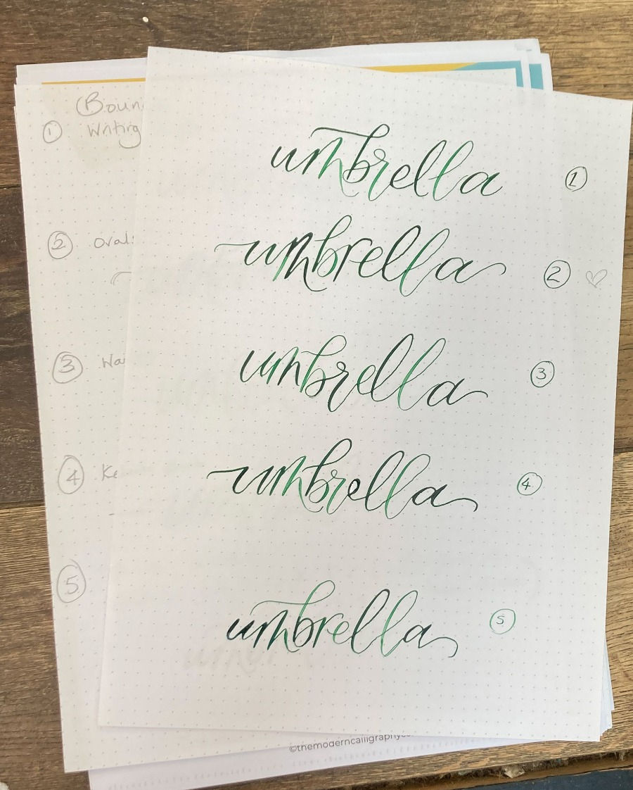
The examples used in this blog are courtesy of Jane Walker who attended our Calligraphy Retreat weekend. We focused on ways to create a calligraphy style of your own and these bouncing exercises were part of that.
We loved her examples and hope that they've helped you to apply bounce to your calligraphy. For more info on the calligraphy retreats that we run, click here.
Here is a worksheet to help you to practice bouncing your calligraphy.


https://apptaixiu.io/ mình lướt thử vì thấy bạn bè nhắc hoài, kiểu vào xem giao diện với cách họ viết thôi. Cảm giác đầu tiên là trang này chia nội dung theo từng mảng khá dễ theo dõi, không bị dồn chữ một cục nên đọc nhanh vẫn hiểu họ đang nói gì. Mình có để ý họ nhắc tới chuyện bảo mật kiểu SSL 256-bit ngay trong phần nội dung, nên nhìn chung tạo cảm giác họ cố gắng trình bày có cơ sở chứ không chỉ nói cho vui. Mà cái mình thích nhất là bố cục gọn, cuộn xuống là thấy các khối tách rõ ràng, tiêu đề kiểu “top 8 app” nhìn phát nhận ra ngay, không…
link kubet hôm bữa mình thấy bạn bè nhắc hoài nên bấm vô coi thử cho biết, kiểu xem giao diện có dễ chịu không thôi. Vào trang cái thấy họ làm bố cục khá thoáng, chia khối nội dung rõ ràng nên lướt nhanh vẫn bắt được ý chính, không bị rối mắt. Mình cũng để ý trong phần giới thiệu họ có nhắc tới giấy phép PAGCOR, đặt ngay trong nội dung nên ai hay để ý chuyện minh bạch chắc sẽ thấy yên tâm hơn chút. Nói chung mình không ngồi đọc hết, chỉ ngó qua cách họ trình bày và mấy tiêu đề lớn, thấy câu “giải pháp cá cược trực tuyến an toàn” được để…
trang chủ 99ok mình mới mò vào thử vì thấy group hay nhắc, kiểu xem có dễ nhìn dễ bấm không thôi. Ấn tượng đầu là giao diện khá thoáng, chia khu vực rõ nên không bị ngợp chữ, lướt một phát là biết chỗ nào là nội dung chính. Mình dùng điện thoại thấy ổn, cuộn xuống mượt, chữ với tiêu đề tách bạch nên không bị rối mắt. Có đoạn họ nhắc tới mã hóa SSL, đọc lướt qua cũng thấy yên tâm hơn chút khi đăng nhập hay thao tác trên web. Mấy phần thông tin kiểu FAQ cũng được đóng khung gọn gàng, nhìn như từng block riêng nên kéo xuống không bị lạc, nhất là…
89 BET mình lướt thử vì thấy bạn bè nhắc hoài, kiểu vào xem giao diện ra sao thôi. Ấn tượng đầu là trang nhìn gọn gàng, chia mục rõ nên không bị ngợp chữ, kéo trên điện thoại cũng ổn. Mình có thấy họ nói về giấy phép kiểu PAGCOR với Isle of Man GSC, đọc lướt qua thì cảm giác đỡ lo hơn chút. Nội dung viết ngắn, tiêu đề to nên tìm thông tin nhanh, không phải căng mắt. Mình không thích mấy trang nhồi nhét, mà ở đây bố cục kiểu từng khối tách bạch nên nhìn khá dễ chịu. Nói chung vào vài phút là nắm được họ đang giới thiệu gì, đặc biệt phần…
BET88 COM mình cũng mới ghé thử vì thấy bạn bè nhắc nhiều, chủ yếu tò mò xem trang họ làm có dễ dùng không thôi. Vào cái là thấy kiểu giao diện tối giản, nhìn khá “gọn mắt”, không bị nhồi chữ quá đà nên lướt nhanh. Mình thích nhất là cảm giác chuyển mục mượt trên điện thoại, bấm qua lại không bị giật lag kiểu mấy trang linh tinh khác. Nội dung thì họ viết theo kiểu thẳng, nói nhiều về tốc độ thao tác với chuyện nạp rút cho nhanh gọn, đọc qua cũng thấy yên tâm hơn chút. Mình không ngồi lâu hay thử gì sâu, chỉ xem cách họ sắp xếp thông tin. Mấy…