
Taking Great Photos of your Calligraphy with your Smart Phone
- May 30, 2023
- 4 min read
Updated: May 31, 2023


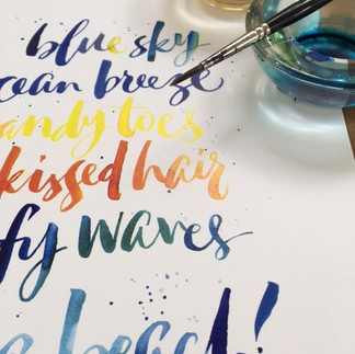


We know how frustrating it can be to spend all your time on your calligraphy, and then when you want to share your work, the colours look wrong, or the image is blurry and distorted. In this post we will outline simple steps that you can take to help your calligraphy look its best in your photographs. No special apps are required beyond the default photo adjustments available on Android and iOS.
1 Find a good source of light.
Placing your piece in natural daylight will make the biggest difference to almost every aspect of the photography process, including the colour accuracy. Take the piece outside to photograph it, avoiding the glare of direct sunlight and any reflections from branches, or you and the phone leaning over it.
If you can’t go outside, place your work next to an open door, or window to act as your light source. Turn off any lights in the room, and stand directly over or in-front of your piece to take the shot. Photographing your piece lit by household bulbs indoors will prevent the camera capturing all the different colours in your piece.
2 Avoid Shadows & Reflections.
The aim is to light the entire piece evenly. Shoot directly in-front or above the piece and check for any shadows being cast. If there are shadows, move around so that they aren't falling onto the work. Don't be tempted to use flash, strong light can reflect, which will result in a glare in the photo.
3 Photograph before Framing.
If you are shooting a framed picture, the glass will reflect you and anything else in front of it. Having the layer of glass there will also obscure details of your artwork, so it is much better to do your photography before framing. If that's no possible, hold the phone far enough away to avoid being seen in the reflection, and check that nothing else has been caught in the glass. Include more of the surroundings around the piece by shooting from further away, then trim away the outer edges the photo in the edit tool.
If you want to show the piece in a frame, hung in situ, take the glass out for the photo and replace it once you've got the shot. Turn your screen brightness all the way up, that way you won’t be compensating for a dim display when you make your edits later.
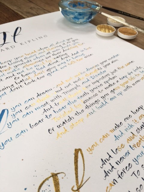
Below shows a framed piece being shot from above, and then cropped in the edit.

4. Avoid Skewing the Perspective.
It's easy to skew the photo and distort the perspective of a piece of work, especially when you are busy trying to avoid shadows! Having the perspective wrong can mean your piece looks contorted and not at all how it is in reality.
The key is making sure the angle of your piece and the angle of your phone are the same. If you’ve laid your piece on the floor and you’re shooting down onto it, there’s built-in help on your iPhone to make sure you’re aligned. Go into your Settings, then Camera and turn Grid function on. These steps are for an iPhone, (but most smartphones will have a similar function). With this function on, when you look down at the image, two crosses appear in the centre of your phone display. Move the phone until just one yellow cross shows – you’re now level so take the shot.

As long as you have managed to take the shot from above, or from directly in front of the piece, you can edit the position later. Make sure your paper edges line up with the edges of your phone screen as much as possible. Edit the photo by using the crop tool, the phone allows you to turn, and alter the perspective, as well as cut away unwanted edges.
5. Crop.
When you’re promoting your work, you want to put out a professional looking image, even if you’re sharing it with friends. Using the ‘crop tool’ to crop and frame your picture to avoid the distraction of the background. To remove the background, go to the edit tool, line the edge of your crop with the sides of your piece. My feet, and the box that the piece is leaning on all need to be removed so that the calligraphy can be the only focus.

6 Create a Situation!
Sometimes, include some background in your final shot can help, showing a sense of scale, or works in progress. Be mindful of what’s showing, and that is doesn't distract the eye. How about the inks or the pens you used to create the piece? When doing this, keep the surface wall or floor behind neutral.

This can also help when a straight-on shot doesn't 'show-off' the texture of the paper, the shimmer of the ink, or other nuances in your work. For this, take care not to obscure your work, but bring the other objects close to the piece, so that the amount of area around the work is kept to a minimum. A detail shot can give a better feeling of a piece and can be taken from the side, so shadows are easier to avoid. Still keep in mind that the light needs to be natural if at all possible, and as even across the work as you can get it. Choose the part you want to focus on, and tap the phones screen at that point. It will then know to get that section sharp, allowing things further away to fade, giving a nice sense of depth of field.
I hope that helps you to take fantastic photographs of all your calligraphy, and we look forward to seeing it on social media very soon.
Best wishes
Kirsten


socolives.jp.net dạo này mình thấy nhiều người nhắc nên cũng ghé thử cho biết, kiểu vào lướt nhanh chứ không ngồi đọc kỹ. Ấn tượng đầu là họ để nội dung World Cup 2026 khá nổi, nhìn phát là biết trang đang tập trung mảng trực tiếp bóng đá. Mình có thấy họ nói đường truyền mượt và nhanh hơn mấy chỗ khác vài giây, nghe cũng ổn nhưng chắc còn tùy mạng nhà mỗi người. Điểm mình thích là giao diện nhìn không bị ngợp, chữ dễ đọc, cuộn xuống là nắm được ý chính luôn. Mấy phần thông tin được chia thành từng khối rõ ràng, nhất là block World Cup 2026 đặt ngay trên trang nên rất…
sunwin dạo này thấy nhiều người nhắc nên mình cũng ghé thử cho biết, kiểu vào xem giao diện ra sao thôi chứ không có ngồi mò kỹ. Vừa mở lên là thấy trang làm khá “dễ thở”, khoảng trắng vừa đủ nên nhìn không bị rối mắt. Mình để ý cái menu đặt khá nổi, bấm qua lại mấy mục thấy phản hồi nhanh, không phải kéo lên kéo xuống tìm chỗ điều hướng. Nội dung thì họ chia theo từng khối riêng, nhìn lướt là biết phần nào với phần nào, đọc nhanh vẫn nắm được ý chính. Nói chung cảm giác thân thiện cho người mới, nhất là cách họ gom thông tin theo block và để…
hitclub dạo này thấy bạn bè nhắc hoài nên mình cũng ghé thử cho biết thôi. Mình không đăng ký hay chơi gì, chỉ lướt xem trang làm có dễ nhìn không. Cảm giác đầu tiên là giao diện khá thân thiện, mấy phần nội dung chia theo khối rõ ràng nên đọc nhanh vẫn hiểu họ đang giới thiệu gì. Mình cũng để ý bấm qua vài mục thì tốc độ phản hồi ổn, không kiểu chờ load lâu rồi giật lag khó chịu. Nội dung viết theo kiểu giới thiệu tổng quan, đọc lướt cũng nắm được họ đang nói về thương hiệu và lý do nhiều người chọn. Nói chung nhìn không bị rối mắt, menu đặt…
luck8 dạo này thấy nhiều người nhắc nên mình cũng bấm vào xem thử cho biết thôi. Mình không đăng nhập hay chơi gì, chỉ lướt qua mấy trang để coi giao diện có dễ nhìn không. Cảm giác đầu tiên là web tải khá nhanh, chuyển mục cũng không bị giật lag nên xem trên điện thoại ổn. Mình có để ý trên thanh địa chỉ hiện biểu tượng ổ khóa SSL, kiểu nhìn là thấy yên tâm hơn chút khi chỉ vào xem thông tin. Nội dung họ chia thành từng khối rõ ràng, cuộn xuống là thấy các phần tách bạch chứ không bị dồn chữ rối mắt. Nói chung nhìn gọn gàng, và mấy khung nội…
Checking my apdcl bill details turned out to be much easier than expected. The information was presented clearly, allowing users to understand everything without spending extra time searching through multiple sections.